Welcome

Passionately curious about Data, Databases and Systems Complexity. Data is ubiquitous, the database universe is dichotomous (structured and unstructured), expanding and complex. Find my Database Research at SQLToolkit.co.uk . Microsoft Data Platform MVP

"The important thing is not to stop questioning. Curiosity has its own reason for existing" Einstein


Showing posts with label data visualization. Show all posts

Thursday, 21 May 2020

Sketch the docs

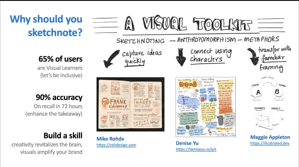
Great to see an interesting technique shared about visual storytelling. A summary about Sketchnoting and Zines is in the last 15 minutes. There were other sessions are Build

Video: https://aka.ms/msbuild2020-sketchnoting-video
Slides: https://aka.ms/msbuild-sketchnoting-slides
Site: http://sketchthedocs.dev
Blog: http://dev.to/nitya


Tuesday, 12 November 2019

The Fourth Industrial Revolution Report 2019

The fourth industrial revolution report 2019 is independent research, commissioned by Big Data LDN and sponsored by Cloudera, surveyed 500 of the UK’s most influential data leaders.

Key Fourth Industrial Revolution Report 2019 findings include:

  1. The human barriers to data-driven culture - The majority (86%) of UK data experts feel a lack of enthusiasm and support prevents creating a data-driven culture.
  2. Lack of data visualisation holds UK organisations back - 45% of UK data leaders see the lack of data visualisation skills as the biggest barrier to business requirements.
  3. Data leaders investing in humans to cross the skills chasm - Over half of UK organisations bridge the business (59%) and technology (57%) skills gap by upskilling employees.
  4. AI and ML slow down - Despite AI and ML being considered as the technology of the moment, this year’s respondents have cited a 21% decrease in its usage.
  5. GDPR still top concern - GDPR is still the dominating regulation for many (46%) UK data experts - its power over UK organisations’ data governance programs grows stronger each year. 
Download the report here

Tuesday, 11 September 2018

PowerBI Report Server

Power BI Report Server is similar to SQL Server Reporting Services (SSRS). Power BI Report Server is on premises, and hosts paginated reports in addition to the Power BI features. There are several types of reports
  • Paginated (standard SSRS type reports)
  • Interactive (PowerBI Desktop)
  • Mobile
  • Analytical (Excel)

PowerBI Pro enables sharing and collaboration with the following features 
  • Build dashboards that deliver a 360-degree, real-time view of the business
  • Keep data up-to-date automatically, including on-premises sources
  • Collaborate on shared data
  • Audit and govern how data is accessed and used
  • Package content and distribute to users with app

There is increased functionality within PowerBI Pro. A comparison between the free PowerBI desktop edition and Pro version is in the table below. Only Pro users can publish content to app workspaces, consume apps without Premium capacity, share dashboards and subscribe to dashboards and reports. Free users can connect to all data sources using connectivity options such as DirectQuery, live connection and use the data gateway. 


Licensing Power BI Report Server

Power BI Report Server is available in two different license modes: 
A Power BI Premium license enables creation of a hybrid deployment (cloud and on-premises).

Capacity


The session delivered by Isabelle Van Campenhoudt at SQL Saturday Cambridge shared this useful capacity planning  paper. It is based on the sample Power BI Report Server topology using virtual machines. 


Saturday, 30 December 2017

Diagrams help explain complex data

Diagrams are useful to help explain qualitative data. There are various diagramming tools that can help with understanding complex systems. These are the main tools that I use

  • Rich Pictures
  • Spray Diagrams
  • Systems Map
  • Influence Diagram
  • Multiple Cause Diagram

The  diagrams above were provided by the Open University and guidelines for constructing such  diagrams are explained.

The Open University guide to using diagrams can be seen in this video.


Monday, 13 November 2017

A Guide to Complexity of Database Systems


The Phd research I undertook examined the complexity of database systems. A summary of the findings are provided

In the turbulent fast moving field of database systems, complexity is found everywhere. The volume, variety and velocity of data is continually expanding as well as the accessibility and realization that businesses have a wealth of untapped data that can be democratised. Not only this, and changes in new technology, but also with the shift in business markets, organisational changes, knowledge required by operating staff and numerous stakeholders, adds to the complexity. Many of these complexities have been discussed in the Claremont and Beckman Reports (Agrawal et al. 2009; Abadi et al. 2016)

This guide takes a 360 degree view of the situation through a systems thinking lens, providing synthesis between the cross disciplinary fields. To be able to explain what complexity is shapes our understanding of the situation and a basic visualisation of this is shared through the use of a graph. The usage of graphs as visual representation are discussed with the presentation of the graph metrics leading to the CODEX, a blueprint for the management of database systems. The CODEX could enable transformation of the management of database systems so that actionable insight can be achieved.

Tuesday, 7 November 2017

Innovative Designs for Innovative Thinking

These Spheres in Seattle will be home of a botanical garden, waterfalls, a river and tree-house like. They are disruptive, pioneering and futuristic to let Amazonians break free for innovative thinking. What an amazingly cool idea. 


Thursday, 14 January 2016

RStudio Cheat Sheets

Some great cheat sheets to help you navigate and use RStudio from https://www.rstudio.com/resources/cheatsheets/

RStudio IDE is the most popular integrated development environment for R.


Data Visualization using the ggplot2 package lets you make beautiful and customizable plots of your data


There are many more cheat sheets.

Monday, 17 August 2015

Data Science

A poster that visualizes the data science process. The high resolution poster is available http://www.icris.nl/


Saturday, 14 March 2015

Free Power BI Designer Desktop App


The new PowerBI dashboard designer in early preview in the US provides data transformation and visual analytics to build reports. It can be downloaded from powerbi.com 


Power BI Designer consolidates Power BI Excel add-in tools: Power Query, Power Pivot and Power View into one application.

Power BI Designer also provides self-service ETL . The free desktop data discovery tool can be downloaded and installed side-by-side with any version of Office or Excel on Windows.

More details are in the great article by Jen Underwood at  http://sqlmag.com/power-bi/introducing-free-power-bi-designer-desktop-app

The use of power BI tools is discussed by James Serra  with tools defined as


•Front-end (Excel) 
•Data shaping and cleanup. Self-service ETL (Power Query) 
•Data analysis (Power Pivot) 
•Visualization and data discovery (Power View, Power Map, Power BI Designer)
• Dashboarding (Power BI Dashboard)
• Publishing and sharing (Power BI sites)
• Natural language query (Power BI Q&A)
• Mobile (Power BI for Mobile)
• Access on-premise data (DMG, Analysis Services Connector) Power Query Power Pivot Power View Power Map Power BI Designer Power BI Dashboard Power BI Site Power BI Q&A Power BI for mobile

James displays the data flow as


http://www.slideshare.net/jamserra/power-bi-made-simple

Wednesday, 4 February 2015

Data Visualization Tools


A couple of Data Visualization tools to help with analysizing structured and unstructured .

Kibana
www.elasticsearch.org/overview/kibana

This is Elasticsearch’s data visualization engine. It allows native interaction with all  data in Elasticsearch via custom dashboards. It has dynamic dashboard panels displaying changes to queries in real-time. Kibana works with any kind of data — structured and unstructured. It helps understand large volumes of data, easily create bar charts, line and scatter plots, histograms, pie charts, and maps.

Banana

Banana is the open source port of Kibana 3 and is available on GitHub at https://github.com/LucidWorks/banana/

Banana is a tool that allows you to create dashboards to visualize data stored in Solr.

The Banana dashboard has several panels that show the data
https://docs.lucidworks.com/display/SiLK/Dashboard+Configuration


Sunday, 23 November 2014

PASS SQL Saturday Business Analytics


Yesterday was the first PASS SQL Saturday Business Analytics event in London and Europe.  This event wouldn’t have been possible without the event organiser Jen Stirrup and a whole raft of other people.  It was an amazing privilege to help at the event  also along side my colleague Jason Linham for the Data Community. The purpose of the event for Business Data now and future: interacting with data to drive the business, at the velocity of the business.  This event supplements the core SQL Server community events such as SQLBits, PASS SQL Saturdays and Local User Groups. The event was for those people Business Analytics and Business Intelligence professionals who were interested in knowing more about analytical features in Excel, Big Data, Azure Machine Learning, Hadoop, R and SQL Server Business Intelligence.

The keynote was presented by Jonathan Woodward, Microsoft UK’s Business Lead for BI, Analytics, Big Data and Data Science on Data Culture : From BI & Analytics to Big Data and Data Science.

There was an introductory session on predictive analytics which covered the history of data mining, algorithm choice and the CRISP-DM methodology. The CRISP-DM (cross-industry process for data mining) methodology is a methodology for providing a robust structured approach to data mining.


A few useful links to find out more
There were various sessions on excel charts with a strong emphasis on never using the 3Dcharts  or cones as a choice for data visualization. (Edward Tufte, The Visual Display of Quantitative Information is a recommended read)

A few resources to look at
Peltier Tech Excel Charts and Programming Blog http://peltiertech.com/
chandoo.org  http://chandoo.org/wp/
www.excelcharts.com/ for dashboards

One of my favourite sessions was delivered by Mark Wilcock on Using R, Cubes And Data Visualisation To Answer “What If” Questions. The session provided some interested insight into how data exploration and data munging lead to data visualization and drew on a combined tool set. It was very interesting to see the benefits and disadvantages of each area R, Excel, SQL and Cubes across the Load, Model and Visualization stack. He recommended watching a presentation delivered by Prof. Mark Whitehorn, School of Computing, University of Dundee on the Monte Carlo scenario.

Microsoft Finance shared how they used the full set of BI tools to deliver finance dashboard and drilldown reports.

The day concluded with an excellent session from Chris Webb on the usage scenarios for Power Query and the use of the M language. 

This was a fun and informative day which I hope will be repeated next year.